Time Series Visualization
Time series data
A time series is a collection of data points gathered over a period of time and ordered chronologically. The primary characteristic of a time series is that it’s indexed or listed in time order, which is a critical distinction from other types of data sets. If you were to plot the points of time series data on a graph, and one of your axes would always be time.
Time series metrics refer to a piece of data that is tracked at an increment in time. For instance, a metric could refer to how much inventory was sold in a store from one day to the next.
Time series data is everywhere, since time is a constituent of everything that is observable. As our world gets increasingly instrumented, sensors and systems are constantly emitting a relentless stream of time series data. Such data has numerous applications across various industries. Let’s put this in context through some examples.
Examples of time series analysis:
Electrical activity in the brain
Rainfall measurements
Stock prices
Number of sunspots
Annual retail sales
Monthly subscribers
Heartbeats per minute
Time series examples
Weather records, economic indicators and patient health evolution metrics—all are time series data. Time series data could also be server metrics, application performance monitoring, network data, sensor data, events, clicks and many other types of analytics data.
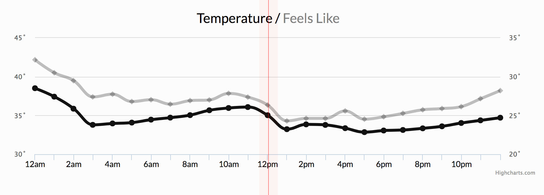
Notice how time—depicted at the bottom of the below chart—is the axis.
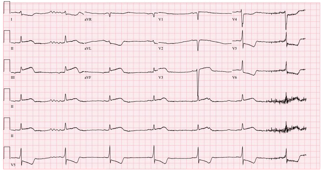
Another familiar example of time series data is patient health monitoring, such as in an electrocardiogram (ECG), which monitors the heart’s activity to show whether it is working normally.
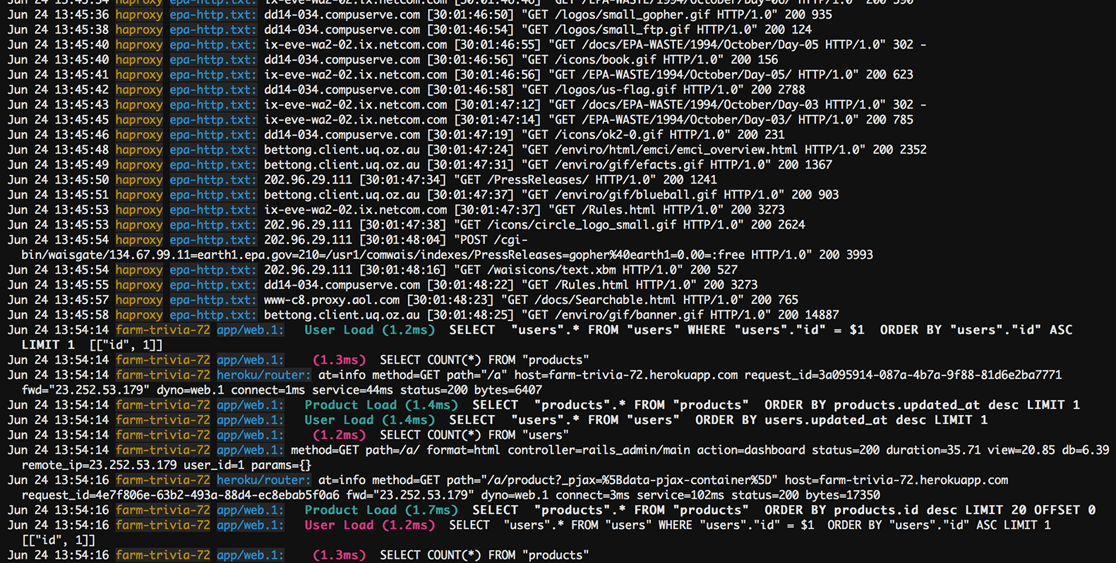
In addition to being captured at regular time intervals, time series data can be captured whenever it happens—regardless of the time interval, such as in logs. Logs are a registry of events, processes, messages and communication between software applications and the operating system. Every executable file produces a log file where all activities are noted. Log data is an important contextual source to triage and resolve issues. For example, in networking, an event log helps provide information about network traffic, usage and other conditions.
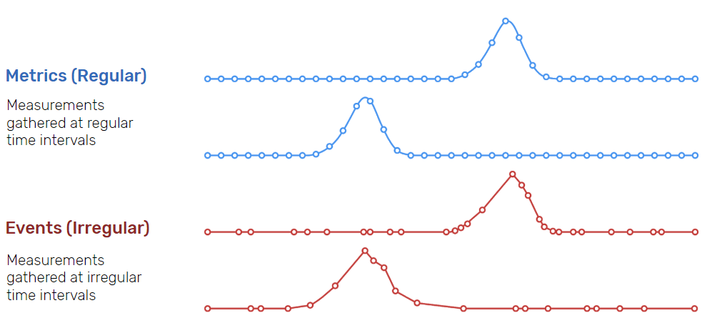
Time series data can be classified into two types:
- Measurements gathered at regular time intervals (metrics)
- Measurements gathered at irregular time intervals (events)
Linear vs. nonlinear time series data
A linear time series is one where, for each data point Xt, that data point can be viewed as a linear combination of past or future values or differences. Nonlinear time series are generated by nonlinear dynamic equations. They have features that cannot be modelled by linear processes: time-changing variance, asymmetric cycles, higher-moment structures, thresholds and breaks. Here are some important considerations when working with linear and nonlinear time series data:
- If a regression equation doesn’t follow the rules for a linear model, then it must be a nonlinear model.
- Nonlinear regression can fit an enormous variety of curves.
- The defining characteristic for both types of models are the functional forms.
Time series data in data visualization can be classified into two main types based on the nature of the data: continuous and discrete.
A. Continuous Data (Regular)
Continuous time series data refers to measurements or observations that can take any value within a specified range. It is characterized by a continuous and uninterrupted flow of data points over time. Continuous time series data is commonly found in various domains, such as:
- Temperature Data: Continuous temperature recordings collected at regular intervals, such as hourly or daily measurements.
- Stock Market Data: Continuous data representing the prices or values of stocks, which are recorded throughout trading hours.
- Sensor Data: Measurements from sensors that record continuous variables like pressure, humidity, or air quality at frequent intervals.
- Financial Data: Continuous data related to financial metrics like revenue, sales, or profit, which are tracked over time.
- Environmental Data: Continuous data collected from environmental monitoring devices, such as weather stations, to track variables like wind speed, rainfall, or pollution levels.
- Physiological Data: Continuous data capturing physiological parameters like heart rate, blood pressure, or glucose levels recorded at regular intervals.
Continuous time series data is typically visualized using techniques such as line plots, area charts, or smooth plots. These visualization methods allow us to observe trends, fluctuations, and patterns in the data over time, aiding in understanding the behavior and dynamics of the underlying phenomenon.
B. Discrete Data (Irregular)
Discrete time series data refers to measurements or observations that are limited to specific values or categories. Unlike continuous data, discrete data does not have a continuous range of possible values but instead consists of distinct and separate data points. Discrete time series data is commonly encountered in various domains, including:
- Count Data: Data representing the number of occurrences or events within a specific time. Examples include the number of daily sales, the number of customer inquiries per month, or the number of website visits per hour.
- Categorical Data: Data that falls into distinct categories or classes. This can include variables such as customer segmentation, product types, or survey responses with predefined response options.
- Binary Data: Data that has only two possible outcomes or states. For instance, a time series tracking whether a machine is functioning (1) or not (0) at each time point.
- Rating Scales: Data obtained from surveys or feedback forms where respondents provide ratings on a discrete scale, such as a Likert scale.
Discrete time series data is often visualized using techniques such as bar charts, histograms, or stacked area charts. These visualizations help in understanding the distribution, changes, and patterns within the discrete data over time. By examining the frequency or proportion of different categories or values, analysts can gain insights into trends and patterns within the data.
Ways for Time Series Data Visualization
To effectively visualize time series data, various visualization techniques can be employed. Let's explore some popular visualization methods:
- Tabular Visualization: Tabular visualization presents time series data in a structured table format, with each row representing a specific time period and columns representing different variables or measurements. It provides a concise overview of the data but may not capture trends or patterns as effectively as graphical visualizations.
- 1D Plot of Measurement Times: This type of visualization represents the measurement times along a one-dimensional axis, such as a timeline. It helps in understanding the temporal distribution of data points and identifying any temporal patterns.
- 1D Plot of Measurement Values: A 1D plot of measurement values display the variation in data values over time along a single axis. Line plots and step plots are commonly used techniques for visualizing continuous time series data, while bar charts or dot plots can be used for discrete data.
- 1D Color Plot of Measurement Values: In this visualization technique, the variation in measurement values is represented using colors on a one-dimensional axis. It enables the quick identification of high or low values and provides an intuitive overview of the data.

- Bubble Plot: Bubble plots represent time series data using bubbles, where each bubble represents a data point with its size or color encoding a specific measurement value. This visualization method allows the simultaneous representation of multiple variables and their evolution over time.

- Scatter Plot: Scatter plots display the relationship between two variables by plotting data points as individual dots on a Cartesian plane. Time series data can be visualized by representing one variable on the x-axis and another on the y-axis.
- Linear Line Plot: Linear line plots connect consecutive data points with straight lines, emphasizing the trend and continuity of the data over time.
- Linear Step Plot: Linear step plots also connect consecutive data points, but with vertical and horizontal lines, resulting in a stepped appearance. This visualization is useful when tracking changes that occur instantaneously at specific time points.

- Linear Smooth Plot: Linear smooth plots apply a smoothing algorithm to the data, resulting in a continuous curve that captures the overall trend while reducing noise or fluctuations. It helps in visualizing long-term patterns more clearly.
- Area Chart: Area charts fill the area between the line representing the data and the x-axis, emphasizing the cumulative value or distribution over time. They are commonly used to visualize stacked time series data or to show the composition of a variable over time.
- Horizon Chart: Horizon charts condense time series data into a compact, horizontally layered representation. They are particularly useful when comparing multiple time series data on a single chart, optimizing screen space usage.

- Bar Chart: Bar charts represent discrete time series data using rectangular bars, with the height of each bar indicating the value of a specific measurement. They are effective in comparing values between different time periods or categories.
- Histogram: Histograms display the distribution of continuous or discrete time series data by dividing the range of values into equal intervals (bins) and representing the frequency or count of data points falling within each bin.
- Gantt Charts: Gantt charts are widely used to visualize project schedules or timelines. They display tasks or events along a horizontal timeline, with bars representing the start and end dates of each task. Gantt charts provide a clear overview of project progress, dependencies, and resource allocation over time.


Comments
Post a Comment