Color Scales in Data Visualization
Color is a powerful tool in data visualization. It can be used to:
Differentiate between categories: Colors can be assigned to different categories of data to make them visually distinct. For example, in a bar chart, you might use different colors to represent different product categories.
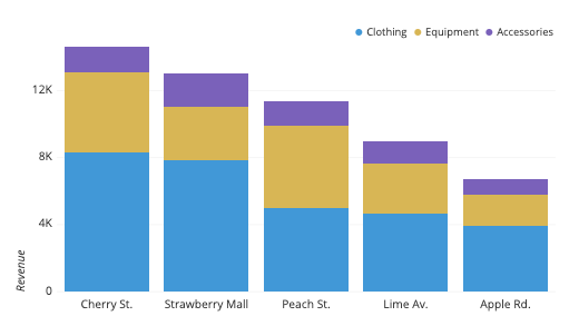
Bar chart with different colors for product categories
Represent quantitative values: Colors can be used to represent the magnitude of a quantitative variable. For example, in a heatmap, you might use a gradient of colors from red to blue to represent temperature, with red representing higher temperatures and blue representing lower temperatures.
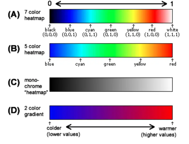
Heatmap with gradient colors representing temperature
Highlight trends and patterns: Colors can be used to highlight trends and patterns in your data. For example, in a line chart, you might use a different color for each line to show how different variables change over time.

Line chart with different colors for trend lines
However, it's important to use color effectively in data visualization. Here are some things to keep in mind:
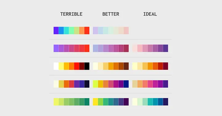
Choose a color palette that is easy to perceive: Avoid using colors that are too similar or that clash with each other. People with different types of color vision should be able to distinguish between the colors in your palette.
Use color consistently: If you assign a color to a category or value in one part of your visualization, use the same color consistently throughout.
Consider your audience: When choosing colors, consider your audience's cultural context and any associations they might have with different colors.
Here are some common types of color scales used in data visualization:
Sequential color scales: These scales use a series of colors to represent a range of values, with the colors typically going from light to dark. Sequential scales are useful for showing how a variable changes over space or time.
Sequential color scale
Diverging color scales: These scales use two contrasting colors on either end of the scale, with a neutral color in the middle. Diverging scales are useful for showing how a variable deviates from a central value.
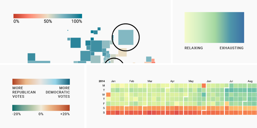
Diverging color scale
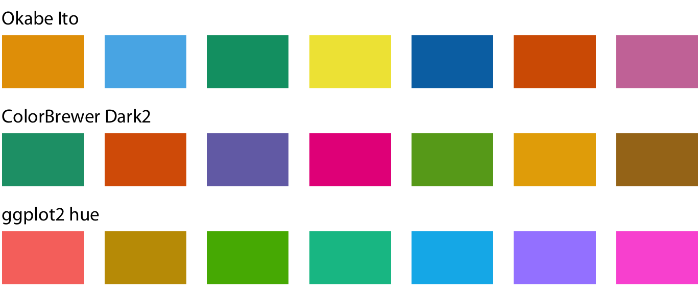
Qualitative color scales: These scales use a set of distinct colors to represent different categories of data. Qualitative scales are not intended to show any order or hierarchy between the categories.
There are many resources available to help you choose color palettes for your data visualizations. Here are a few:
ColorBrewer: A popular tool for creating color palettes that are easy to perceive and colorblind-safe.

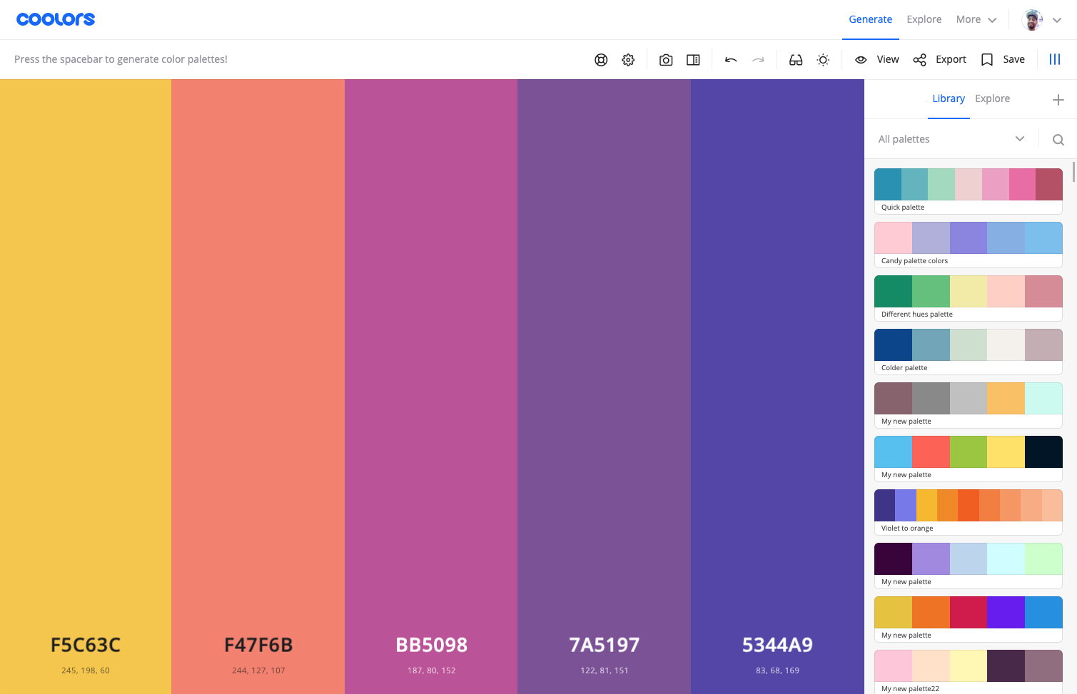
Coolors: A web-based tool that allows you to create and explore color palettes.
Adobe Color: A tool from Adobe that provides a variety of color palette creation and exploration features.

By using color effectively, you can create data visualizations that are both informative and visually appealing.


Comments
Post a Comment