Coordinate Systems and Axes in Data Visualization
Coordinate systems and axes are the fundamental building blocks of data visualization. They provide the framework for plotting data points and enabling viewers to understand the relationships between different variables. Choosing the right coordinate system and axes is crucial for creating effective and informative visualizations.
Common Coordinate Systems:
Cartesian Coordinate System: This is the most widely used system,
with two perpendicular axes (x and y) intersecting at a point called the
origin. Each data point is represented by its coordinates (x, y). This system
is well-suited for data with linear relationships.


Logarithmic Coordinate System: This system compresses large values,
making it ideal for data spanning several orders of magnitude. Distances on the
log scale represent multiplication by a constant factor.

Geographical Coordinate System: This system uses latitude and longitude to represent locations on the Earth's surface. It's essential for maps and geospatial data visualizations.

Choosing the Right System:
The best coordinate system for your visualization depends on the nature
of your data and the message you want to convey. Consider the following
factors:
Number of dimensions: How many variables are you trying to
visualize? Cartesian systems are suitable for two dimensions, while polar or
radial systems can handle circular data.
Range of values: Do your data values vary greatly? Logarithmic
scales can compress large ranges, while linear scales are better for smaller,
evenly distributed data.
Relationships between variables: Are there linear, cyclical, or
other relationships between your variables? Choose a system that reflects these
relationships accurately.
Axis Design:
Labels: Clearly label both axes with meaningful titles that reflect
the variables they represent.
Units: Include units of measurement on the axes, especially for
quantitative data.
Ticks and Gridlines: Use tick marks and gridlines to help viewers
estimate values and compare data points. However, avoid cluttering the chart
with excessive gridlines.
Scale: Choose an appropriate scale that displays all data points
without distortion. Avoid zooming in or out excessively.
Examples:
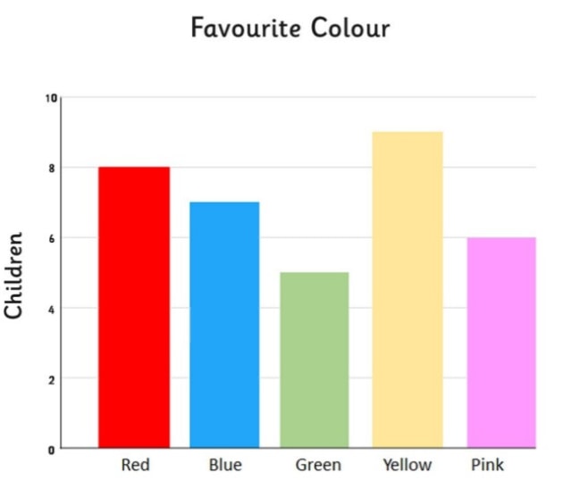
Scatter Plot: Uses a Cartesian coordinate system to visualize the
relationship between two continuous variables.

Line Chart: Uses a Cartesian coordinate system to show trends over
time. The line connects data points chronologically.

By understanding and using coordinate systems and axes effectively, you
can create data visualizations that are informative, engaging, and easy to
understand.


Comments
Post a Comment