Aesthetics in Data Visualization
Aesthetics play a crucial role in data visualization. They're not just about making charts and graphs look pretty; they're about using visual elements to effectively communicate information and insights from your data
Key principles of aesthetics in data visualization:
Clarity and Hierarchy: The most important principle is that your visualization should be clear and easy to understand. The hierarchy of information should be clear, with the most important elements being the most prominent. Avoid visual clutter that can distract from the data.
Color Palette: Color is a powerful tool that can be used to highlight important information, differentiate between categories, and create a visually appealing chart. However, it's important to use color effectively. Choose a color palette that is easy to perceive for people with different types of color vision. Avoid using too many colors, and make sure that the colors you use are meaningful in the context of your data.
Formatting: Consistent formatting is essential for creating a professional and polished look. Use the same fonts, line styles, and marker shapes throughout your visualization. This will help to create a sense of unity and make it easier for viewers to see patterns and trends.
Whitespace: Whitespace is the space between the elements of your visualization. It's important to use whitespace effectively to avoid visual clutter and improve readability. Too much whitespace can make your visualization look sparse, while too little can make it look cramped.
Balance and Proportion: The elements of your visualization should be balanced and in proportion to each other. This will create a visually pleasing and harmonious chart.
Storytelling: Think about how your visualization can tell a story. Use visual elements to highlight key trends, relationships, and insights from your data.
Creating aesthetically pleasing data visualizations:
Use data-driven color palettes: There are many tools and resources available to help you choose color palettes that are both visually appealing and appropriate for your data.
Consider your audience: When choosing visual elements, consider your audience's familiarity with data visualization and their cultural context.
Get feedback: Get feedback on your visualizations from others before you finalize them. This will help you identify any areas where you can improve the clarity, effectiveness, or aesthetics of your work.
Examples of effective data visualizations that use aesthetics well:
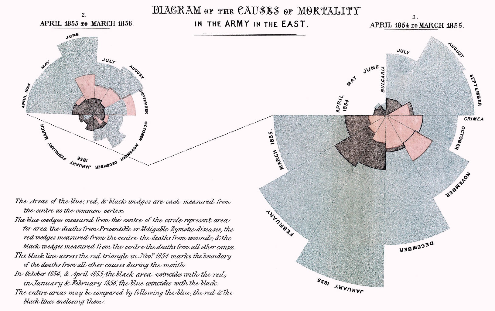
Nightingale Rose Diagram: This visualization uses color and size to effectively show the composition of the British Army in 1854
Hans Rosling's Gapminder World: This animated visualization uses color, size, and movement to show trends in income and life expectancy over time.

Edward Tufte's Small Multiples: This technique uses multiple small charts to show different aspects of the same data.
.png?format=2500w)


Comments
Post a Comment