Posts
Benefits of Data Visualization
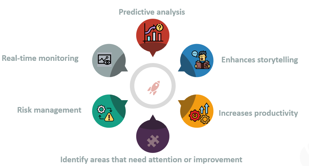
Data Viz over Traditional Methods Simplifies complex data Data visualization transforms large and complicated datasets into a visual format, making the data easier to understand and interpret. It allows people to view data in a more digestible and accessible way. Reveals patterns and trends Graphs, charts, and other visual formats help reveal patterns, correlations, and trends in the data that might not be as noticeable in raw, numerical form. This ability to quickly recognize and understand these patterns can lead to faster decision-making, saving time and resources. Aids in decision making By helping to highlight key insights, data visualization aids in faster and more effective decision-making. Businesses can quickly assess their performance, competitive landscape, customer behavior, and market trends, allowing them to make informed strategic decisions. Improves retention and engagement Visual data is more engaging and easier to remember than raw data. A well-designed vi...
Choice of Data Visualization Methods and Techniques

Factors That Impact the Choice of Data Visualization Methods and Techniques There are several factors that can influence the choice of data visualization methods and techniques. These factors include: Purpose of Visualization : Understanding why you're creating the visualization is key. Are you trying to identify trends, show relationships, compare values, or present a narrative? The purpose dictates which visualization methods are most appropriate. For instance, if you want to compare the distribution of a categorical variable, a bar chart might be suitable. Type of Data : The nature of the data being visualized is crucial. Is it numerical, categorical, temporal, spatial, or textual? Different types of data may require different visualization techniques. For example, a time-series data might be best represented using line charts, while geographical data might be better suited for maps. Audience: Consider who will be viewing the visualization. Are they experts in ...
Box Plots

Box & Whiskers Plot - Definition n Construction We use these box plots or graphical representation to know: Distribution Shape Central Value Variability When we plot a graph for the box plot, we outline a box from the first quartile to the third quartile. A vertical line that goes through the box is the median. The whiskers (small lines) go from each quartile towards the minimum or maximum value, as shown in the figure below. A box and whisker plot is a graph that exhibits data from a five-number summary, including one of the measures of central tendency . It does not display the distribution as accurately as a stem and leaf plot or histogram does. But, it is principally used to show whether a distribution is skewed or not and if there are potential unusual observations present in the data set, which are also called outliers. Boxplots are also very useful when huge numbers of data collections are involved or compared. The box and whisker plot displays how the data...